| | dog-ear (dôgîr, dg-)n.A turned-down corner of a page in a book.
tr.v. dog-eared, dog-ear·ing, dog-ears
1. To turn down the corner of (the page of a book).
2. To make worn or shabby from overuse. | Sometimes i'll have the need to have a "Clickable" element within a box or div on a page. Or maybe the box is "marked" with a dog-ear to show that you can click for some more information that is not currently visible. For this article my example is on a day within a calendar.
First I'll build my div: <div class="mydiv" ></div>
Easy Enough. Now for a bit of style: <style>
.myDiv {
border: #CCC 1px solid;
display:inline-block;
height:189px;
width:156px;
border-collapse:collapse;
background-color: #FFF;
position:relative;
}
</style> And we have a box.
Now lets dog ear it. First add another element inside the first div, I'm just using another div: <divclass="mydiv">
<div class="mycorner"></div>
</div> And some style for our corner: <style>
.mycorner {
width:0px;
height:0px;
border-top: #09F 17px solid; /*inside part*/
border-right: white 25px solid; /*outside part*/
position:absolute;
bottom:-1px;
right:-1px;
-webkit-box-shadow: -3px -2px 5px 0px rgba(0,0,0,0.2);
-moz-box-shadow: -3px -2px 5px 0px rgba(0,0,0,0.2);
box-shadow: -3px -2px 5px 0px rgba(0,0,0,0.2);
}
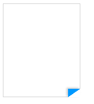
</style> | | And as easy as that we have a Great looking folder corner using CSS. No images needed! A couple parts of this CSS to note: I made the corner blue so it's easier to see. I also added some shadowing, it just looks better with some depth. (Create shadows easily here: http://www.cssmatic.com/box-shadow. And keep in mind IE still doesn't play nice with shadows) And to get fancier you could always start with a plain corner and then fold it on hover. Like this: <style>
.mycorner {
width:0px;
height:0px;
border-top: transparent 17px solid; /*inside part*/
border-right: transparent 25px solid; /*outside part*/
position:absolute;
bottom:0px;
right:0px;
-webkit-box-shadow: 3px 2px 5px 0px rgba(0,0,0,0.2);
-moz-box-shadow: 3px 2px 5px 0px rgba(0,0,0,0.2);
box-shadow: 3px 2px 5px 0px rgba(0,0,0,0.2);
cursor:pointer;
}
.mycorner:hover {
width:0px;
height:0px;
border-top: #09F 17px solid; /*inside part*/
border-right: white 25px solid; /*outside part*/
position:absolute;
bottom:-1px;
right:-1px;
-webkit-box-shadow: -3px -2px 5px 0px rgba(0,0,0,0.2);
-moz-box-shadow: -3px -2px 5px 0px rgba(0,0,0,0.2);
box-shadow: -3px -2px 5px 0px rgba(0,0,0,0.2);
}
</style> Notice I have the shadow on the outside of the corner to alert the user that the element is active when not hovering.
Play around with this technique and you will see a whole lot of easy to create shapes front strictly CSS. I also use a similar approach to make Pointers/Arrow tips.
Happy folding!
This blog will seem simple to most but if it helps one person then mission accomplished!
As a programmer I often fall into bad habits. Mostly to speed up my job as I have old code that I will just re-use even if it may not be the best way to accomplish the task.
I've gotten pretty reliant on CFForm and more so "Binding" between form fields. A part of this I find myself doing a lot is related to screens I write for users to edit data. So the first form field will be a select box, then once selected I fill the rest of the form fields in. So binding makes this pretty easy with the built in AJAX that ColdFusion has built in. But why not just roll my own JavaScript? before ColdFusion included the handy bindings I would do silly things like have a bunch of value pairs in the class attribute or some other open attribute. Then with JavaScript I would parse through that string and pick out what I wanted/needed.
DUMB! Works, yet so much code to accomplish such a simple tasks.
data-
Somewhere along the way I started to use data-attributes in my forms. This simple switch in technique has made my code so much cleaner and very easy to de-bug or make changes in needed. I also feel better about not "cheating" and using the built in CFajax.
So lets look at a simple example:
Here's an example select box with data attributes: <select name="AddressID" id="AddressID" onChange="SetFormFields();">
<option value="">[Select Address to Edit]</option>
<cfoutput query="GetLocs">
<option value="#AddressID#" data-Address="#Address#" data-City="#City#" data-State="#State#" data-Zip="#Zip#">#Address# #City#, #state# #zip#</option>
</cfoutput>
</select> Very simple, and very clean.
Now the JavaScript to use these data attributes: <script>
function SetFormFields() {
var mySelect = document.getElementById(''AddressID');
document.getElementById('Address').value = mySelect.options[mySelect.selectedIndex].attributes['data-Address'].value;
document.getElementById('City').value = mySelect.options[mySelect.selectedIndex].attributes['data-City'].value;
document.getElementById('State').value = mySelect.options[mySelect.selectedIndex].attributes['data-State'].value;
document.getElementById('Zip').value = mySelect.options[mySelect.selectedIndex].attributes['data-Zip'].value;
}
</script> And that's it. A simple and clean way to populate many fields with a single select box using JavaScript and data-Attributes!
 Some Gradients! Some Gradients! Remember when we used to have to use 1 pixel ping image strips for gradients? Often they would be just black or white fading to transparent.
Code would look something like this:
background: url(../images/gradient.png) #EFEFEF bottom repeat-x; Simple and worked everywhere, right? However, it was not fancy enough and you had to load that huge 2kb ping image.
Well, luckily it's gotten even easier. And here is a code sample:
background: rgb(125,126,125); /* Old browsers */
background: -moz-linear-gradient(top, rgba(125,126,125,1) 0%, rgba(14,14,14,1) 100%); /* FF3.6+ */
background: -webkit-gradient(linear, left top, left bottom, color-stop(0%,rgba(125,126,125,1)), color-stop(100%,rgba(14,14,14,1))); /* Chrome,Safari4+ */
background: -webkit-linear-gradient(top, rgba(125,126,125,1) 0%,rgba(14,14,14,1) 100%); /* Chrome10+,Safari5.1+ */
background: -o-linear-gradient(top, rgba(125,126,125,1) 0%,rgba(14,14,14,1) 100%); /* Opera 11.10+ */
background: -ms-linear-gradient(top, rgba(125,126,125,1) 0%,rgba(14,14,14,1) 100%); /* IE10+ */
background: linear-gradient(to bottom, rgba(125,126,125,1) 0%,rgba(14,14,14,1) 100%); /* W3C */
filter: progid:DXImageTransform.Microsoft.gradient( startColorstr='#7d7e7d', endColorstr='#0e0e0e',Gradient ); /* IE6-9 */ Ridiculous! This is the "new" way and probably, for reasons I don't know and don't care to look up, is the correct way to handle gradients these days. Luckily though, I found a website that helps with this: http://www.colorzilla.com/gradient-editor/They have made a simple to use tool that really takes all the guess work out (hand coding). So if nothing else, this blog will serve as my bookmark back to colorzilla.com's gradient editor/creator.
Why don't I blog? This question is one I have asked myself too many times to count over the years. I visit blogs nearly every work day. Most of them dealing with tricks, tips, or techniques of how to write a piece of code. I'd say 99% of blogs I visit have to do with my job, writing custom code to be displayed in internet browsers. For fun I'm finally gong to answer that question, or better yet, list my excuses: - I don't have time.
- I'm not a good writer.
- Why would anyone care/Who would read it?
So, boiled down, there they are! I'm busy, I suck, & who cares. Truth be told, I am busy. I have 4 kids (ages: 3,6,11, & 14). So this excuse has some legs. But I'm sure that I'm not the only one who is busy. Now the last two excuses are just that, excuses! And I'm ready to stop making them. I do some pretty cool shit, and even if it's just for me, I'd like to start to write about it. So actually, I'll be forced to become a better writer through blogging? Possible I guess. Who's going to read it? I don't even care. Even if I can share one cool thing that helps one person then that's probably enough to keep me going for a little while. So expect most of my posts to deal with writing Code! I might even touch on some of the other important things in my life occasionally like Wife & Kids, Sports, and BBQ.
|

 RSS Feed