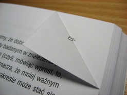
 | dog-ear (dôgîr, dg-)n.A turned-down corner of a page in a book. |
Sometimes i'll have the need to have a "Clickable" element within a box or div on a page. Or maybe the box is "marked" with a dog-ear to show that you can click for some more information that is not currently visible. For this article my example is on a day within a calendar.
First I'll build my div:
First I'll build my div:
<div class="mydiv" ></div>
Easy Enough. Now for a bit of style:
<style>
.myDiv {
border: #CCC 1px solid;
display:inline-block;
height:189px;
width:156px;
border-collapse:collapse;
background-color: #FFF;
position:relative;
}
</style>
And we have a box.
Now lets dog ear it. First add another element inside the first div, I'm just using another div:
Now lets dog ear it. First add another element inside the first div, I'm just using another div:
<divclass="mydiv">
<div class="mycorner"></div>
</div>
And some style for our corner:
<style> | 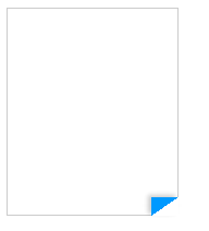 |
And as easy as that we have a Great looking folder corner using CSS. No images needed!
A couple parts of this CSS to note:
I made the corner blue so it's easier to see. I also added some shadowing, it just looks better with some depth. (Create shadows easily here:http://www.cssmatic.com/box-shadow. And keep in mind IE still doesn't play nice with shadows)
And to get fancier you could always start with a plain corner and then fold it on hover. Like this:
<style>
.mycorner {
width:0px;
height:0px;
border-top: transparent 17px solid; /*inside part*/
border-right: transparent 25px solid; /*outside part*/
position:absolute;
bottom:0px;
right:0px;
-webkit-box-shadow: 3px 2px 5px 0px rgba(0,0,0,0.2);
-moz-box-shadow: 3px 2px 5px 0px rgba(0,0,0,0.2);
box-shadow: 3px 2px 5px 0px rgba(0,0,0,0.2);
cursor:pointer;
}
.mycorner:hover {
width:0px;
height:0px;
border-top: #09F 17px solid; /*inside part*/
border-right: white 25px solid; /*outside part*/
position:absolute;
bottom:-1px;
right:-1px;
-webkit-box-shadow: -3px -2px 5px 0px rgba(0,0,0,0.2);
-moz-box-shadow: -3px -2px 5px 0px rgba(0,0,0,0.2);
box-shadow: -3px -2px 5px 0px rgba(0,0,0,0.2);
}
</style>
Notice I have the shadow on the outside of the corner to alert the user that the element is active when not hovering.
Play around with this technique and you will see a whole lot of easy to create shapes front strictly CSS. I also use a similar approach to make Pointers/Arrow tips.
Happy folding!
Play around with this technique and you will see a whole lot of easy to create shapes front strictly CSS. I also use a similar approach to make Pointers/Arrow tips.
Happy folding!

 RSS Feed